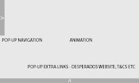
These are the first two wireframes I came up with. If you scroll over the arrow with your mouse, the navigation bars would pop up. In the background would be the animation that Gavin is creating. The website would have sound, but it would be possible to turn it off. The navigation bar would consist of 5 pages; Home, About, Events, The bottle and Contact, and the bottom navigation would consist of extra links, such as a link to Desperados' official website, T&Cs and other miscellaneous content.
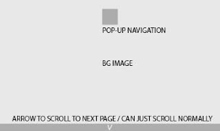
This is the next wireframe I came up with. It's very simplistic, but I think that's successful as it would mainly rely on the background of the website to create the party illusion, which is what I've seen on most alcohol websites. The navigation would be in the centre and would be a link, once you click the navigation, it would load up a menu page of the other important links for the website. The bottom arrow would be clickable, and would smoothly scroll to the next page of the website. This is my particular favourite wireframe, as it is a style of website that is used widely today and is very successful and incredibly easy to navigate - this website also allows all of the content to be seen without even clicking a button, meaning it's even easier to navigate.
This is the final wireframe that I have designed. It looks incredibly simple - because it is. The content of this webpage would be the main success, not the actual website design. For this reason, I don't think it will be successful for my own design process as it would mean very little work on my part, however I am going to ask for feedback from my group. Once I have got feedback, I will create more wireframes of the final website style chosen.
FEEDBACK / CRIT:
As suspected, both collaborators agreed with me and said they thought that the second website would be the most successful - I showed them the Bring Me The Horizon website so they could get a better idea of how it would work and how to navigate. They agreed that the third website wouldn't really show off any of my own talent as it would mainly be image based, and that the first website could work, however if using a slow computer, it can be quite tedious to use with pop up navigations - something I never really thought of.
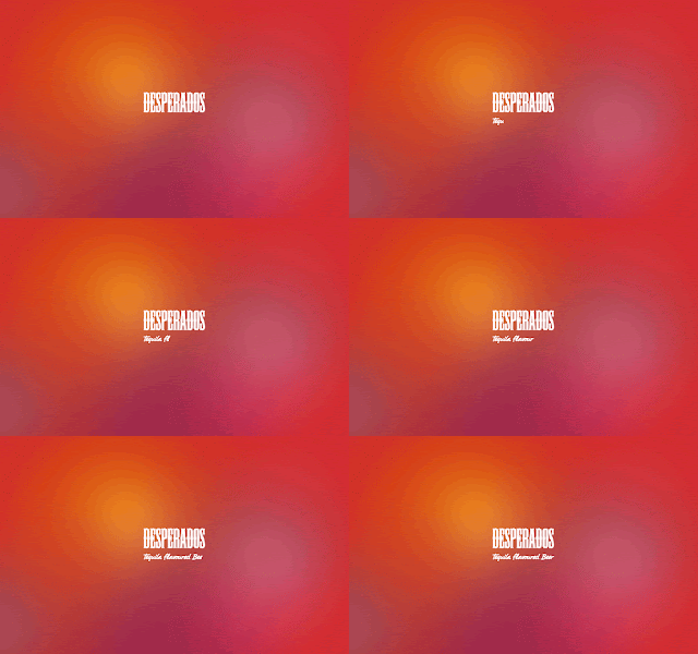
I finished this gif just after getting feedback - it was a quick idea of how the loading page for the website could work. The smaller, script typeface would work as the loading bar. I showed it to my group and they also thought it would be really successful on the website as it's different to anything they have seen before.
I am now going to carry on designing the wireframes for the final chosen website. This should be quite a simple task, as I think that the website should be kept quite minimal as to make the content really stand out.


No comments:
Post a Comment