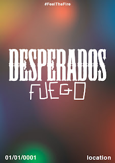
Now its my turn to make some posters. This is the first poster that I created. It uses all of the colours in the packaging to try and symbolise the energy of the event. I originally thought it was good, however now I don't think it's successful on a smaller scale. On a bigger scale, it wasn't at obvious that the colours weren't blended together.
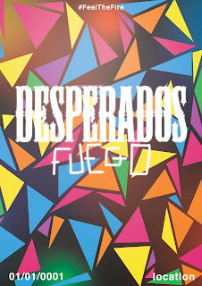
This is the next poster design. It uses the same pattern used in the packaging and is very vague - which I think is a good thing, as the person would wonder what it is and then go home and search/use their phone right there and then to find out what the poster was about.
I then combined both of the above posters. I think this is the most successful poster design so far, as it's very bright and colourful and would definitely catch the attention of anybody walking past. Now I am going to try to make a poster about the bottle.
Next I tried to incorporate the pattern for the packaging on a poster. These poster designs were unsuccessful as they were far too crowded and actually quite confusing to look at. They would be successful in gaining the viewers attention, but they definitely wouldn't be interested as they're very confusing. The idea behind these posters was that the white would be what the poster looked like in the daylight, and the other would be what it looked like at night - all of the shapes would glow in the dark.
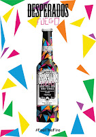
I tried to make this poster design a lot less complicated by getting rid of a lot of the shapes. I believe this made it a lot more successful as it no longer hurt to look at and actually just reiterated the packaging design, which I think worked.
I then decided to get rid of the pattern all together. I don't think it needed the pattern, as the pattern was already present on the packaging, and it was just complicating the design. I will ask for feedback on all of these posters from my group and see what they say, but I think they will agree.


No comments:
Post a Comment