”An updated banknote proposal created for the United States of America within the Master thesis design project “WORTH: The Aesthetics of Global Interest” while attending the Academy of Art and Design / Visual Communication Institute (Basel School of Design) in Switzerland. It was printed for the Diplom Exhibition in 2011 in Basel.
Inspired by the Swiss Franc’s (CHF) ambitious redesign process (the currency is thoroughly redesigned every 20 years by way of contest) The goal was to develop a similar updated iconographic system better representing the advancements and culture within the American society.
This particular series plays on themes of human discovery and endeavors to connect achievement, theory and the fundamental properties of life.
This is of course not a conspiracy to trivialize or shun the great deeds of the past, but to communicate principle rather than effigy permeating through the spirit of industrial, organic and elemental systems.”
- Travis Purrington

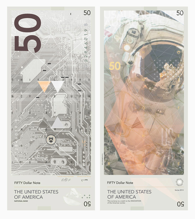
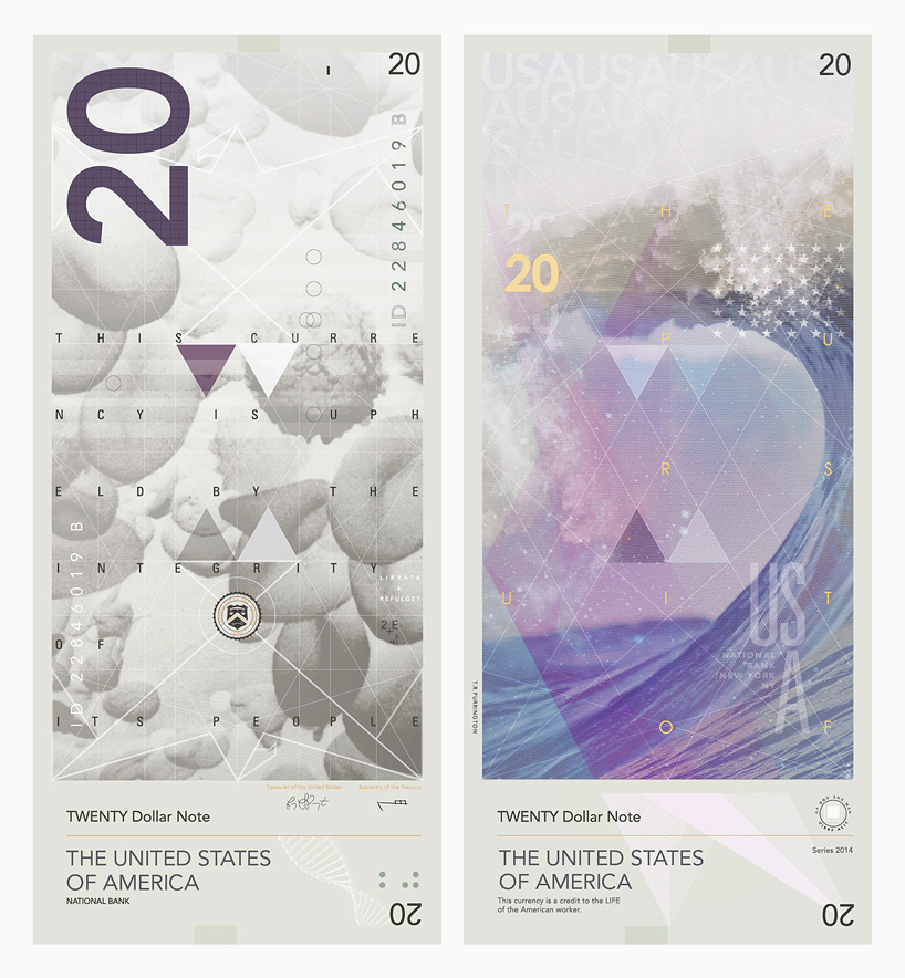


The design of these dollar bills is incredibly complex, however each follows the same grid format. These designs are incredibly modern, however don't specifically follow the rules of modernism, as they don't have a huge amount of negative space. All the type is left alligned, however, and there is a small amount of negative space.
They are all very interesting designs, however they are kept consistent through the use of the shapes and the grid used. The use of colour and imagery makes each note stand out from the next, and they are really impacting and memorable due to this.
No comments:
Post a Comment