This bank note was designed by Dowling Duncan and is a redesign of the US Dollar Bill. The use of bold pantone colours make the notes really eye catching and interesting and also make the notes desirable as collectibles. The imagery used is all relevant for America, for example, the President Barack Obama, and the symbol of the golden eagle. These designs are much more relevant than the current Dollar bill, as they are current and not solely about politics.

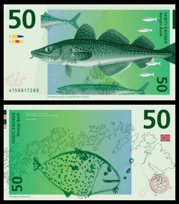
These Norwegian Kroner bank notes are designed by Alask Gurholt Ronse. The concept of the notes is that on one side would be a detailed illustration of something specific to Norway, for example, the fish, and on the reverse side of the bank note would be a child's drawing of the fish. It's a really interesting concept, as it shows that Norway know that children are the future.
These notes were designed by The Metric System and Snøhetta for the Central bank of Norway, Norges Bank. The concept for these notes is really admirable; it is a beautifully illustrated design on one side of the note, and on the reverse is a pixelated colour scheme. They're very minimal bank note designs and really aesthetically pleasing because of this factor.

Barbara Bernat designed these bank notes for the Hungarian Euro. One side of the designs feature an illustrated image of an animal that is found across Europe, and the other side is an illustration of a plant that is found across Europe. The colour scheme of the bank notes make them really pop out and they are a lot different from anything that exists today. The use of negative space is also key, as it makes the designs even more eye catching.

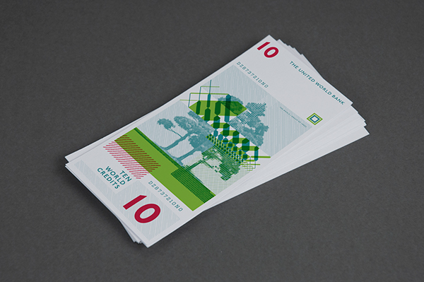
This note was designed by Lili Koves for her idea of the future, The United World Bank. The notes feature universal values on the front of the note, such as nature, and on the back of the design is the inside; what matters the most. For example, this particular design shows the inside of a tree.
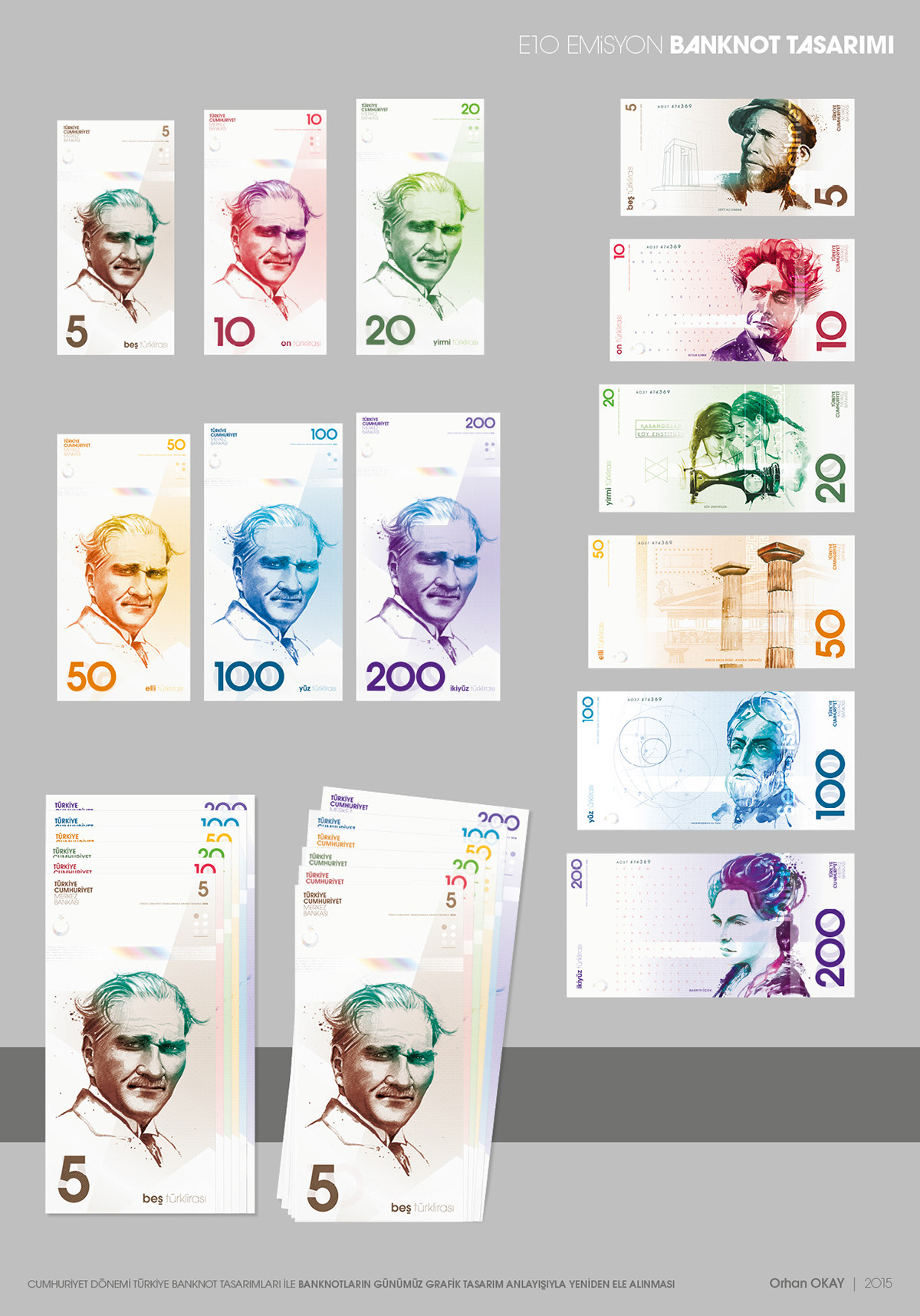
Orhan Okay, Turkish Lira Currency Design. This design is quite similar to regular bank note designs, however it has a key focus on other important people of Turkey, not just political. The design is a lot more up to date with current design and has a lot of negative space and use of colour in order to keep the attention of the viewer. The designs are very consistent through-out each bank note design, as the type is kept in the same place, and the same style of design is used for the different illustrations.
No comments:
Post a Comment