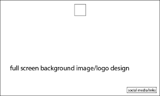
Before designing my website, I decided to create some wireframes to get an idea of how I can layout my pages and the format each page will follow (to an extent). I didn't do this previously and I think this would've definitely helped me come up with a cleaner looking website. All of my wireframe designs have been kept very simplistic as this makes it easier when the developer would come to coding the website (in theory). The wireframe directly below would be very easy to navigate and the album cover/logo design would be the main focus of the website. It would be very slick and simplistic, however successful as it would be easy to access each page and all the information needed about the band.
The next wireframe is also simplistic. It would have a background image of the band, or possibly the latest music video from the band playing full screen in the background. The navigation would be left aligned and the social media links could either be left aligned or right aligned depending on the background. The navigation and social media links would also be transparent so the image/video could be seen through, however when hovered over it would turn to a bright colour - possibly red as from researching, I have found out people are more likely to click a link that is red.
This wireframe is very similar to the one above, as in it would have similar features, however the navigation would be different. Instead of having the navigation left aligned, it would be central and it would be a click down navigation. I think this would be more successful as it would emphasise that the main focus of the website is the band and music - which would be seen in the video background. The social media links could either be included in the click down navigation, or could be at the bottom of the page as icons.


No comments:
Post a Comment