I also looked into what comes up when you search alcohol on Google. The images below came up. I think it would be really effective if I had a cocktail as my logo, as the glass is really noticable and original, whereas there are lots of things that come in bottles. I noticed that the colour orange came up a lot, so for this reason I am going to make my app orange.


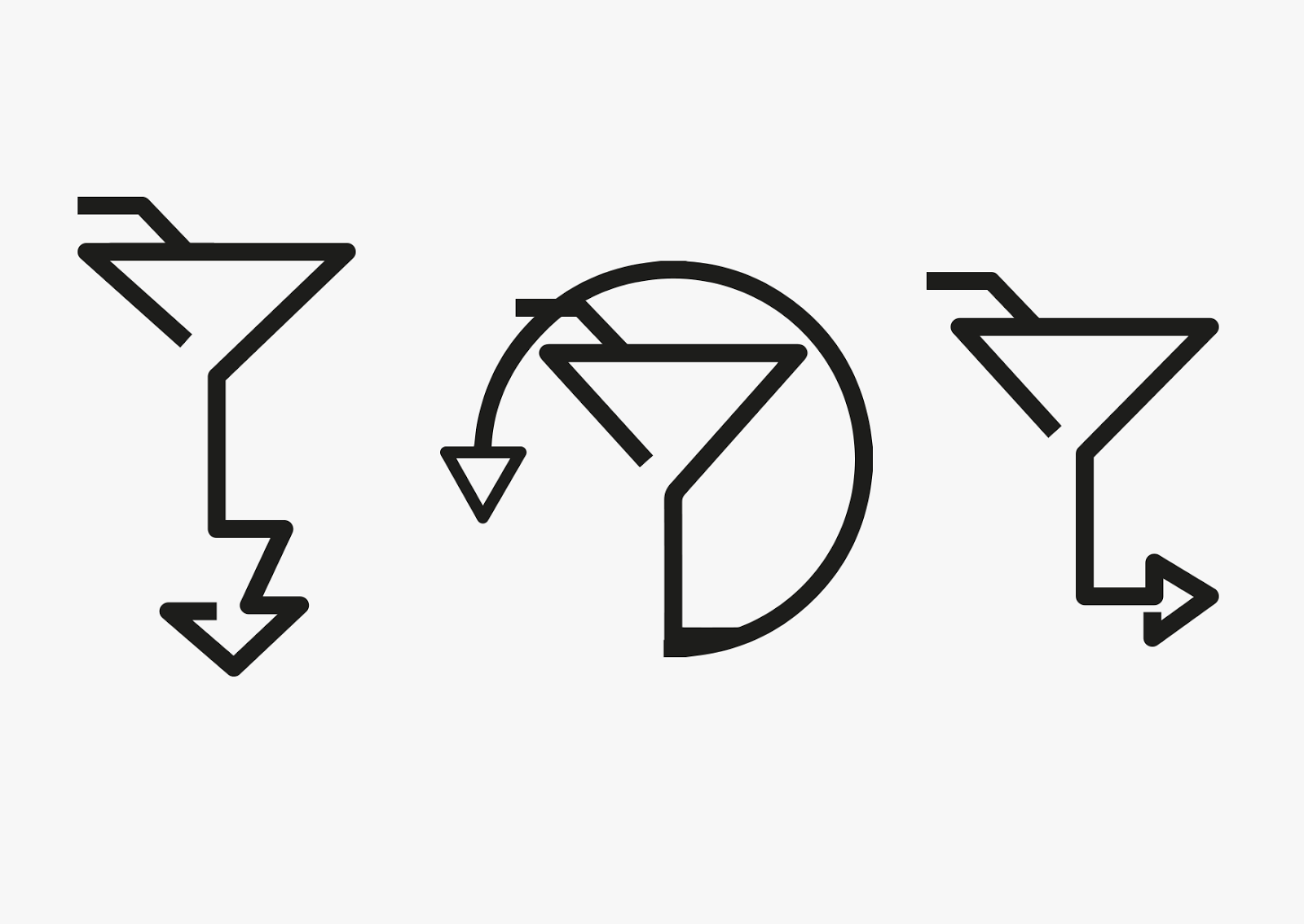
I want my logo to be very minimal, as I feel like most of the social networking apps that are out there at the moment are simplistic. These are the three logo ideas I came up with. Personally, I think the last design is the most effective, as the first is too much for the eye to handle and the second seems very enclosed and I want it to be quite free and have a lot of negative space.
No comments:
Post a Comment