
The next was also taken in Warrington. I personally prefer this one, as I think the position of the text works a lot better and the colours really compliment each other.
This was taken in Warrington town. I think it's good as the black and white image would look really good in a frame. The colour didn't show up too well so I decided I would add a low opacity circle as it made the type stand out a little more.

This was also taken in town and I think it works really well. I think it's strange that the image is of a carpark, however it still seems quite professional and the colours work really well.

This image was taken in London on Brick Lane. I think it's quite an effective design, however it is a bit boring to look at.

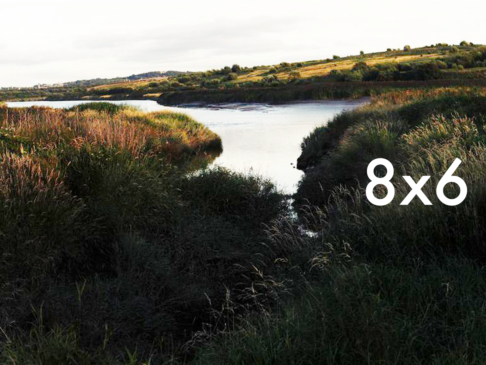
I then decided to change the way I would display the size of the frames. This can be seen below. I looked through some of my photographs on Flickr that can be found HERE. I then added different sizes to the photograph. I think these designs looked a lot slicker, so I figured this is the style of design I will go for once I have taken some photographs for this project, and not ones I have already taken.

I inverted the type and shape on the images, so that you could see it on whatever image I would put it on and I think it was really effective and looked slick.

I then played with the shape that the type was inside, and also the position of the type and shape. These can be seen below. I think the square definitely works, but so does the circle - however the circle only looks good in the centre of the image, and depending on what the images I take look like, this could be an issue if I don't use the rule of thirds.

No comments:
Post a Comment