I am going to go to a couple of shops over the weekend and do some research into backing paper that already exists. In the meantime, however, I am going to look into backing paper online, as I would like to atleast get an idea of the backgrounds I would like to create after doing some primary research in store.
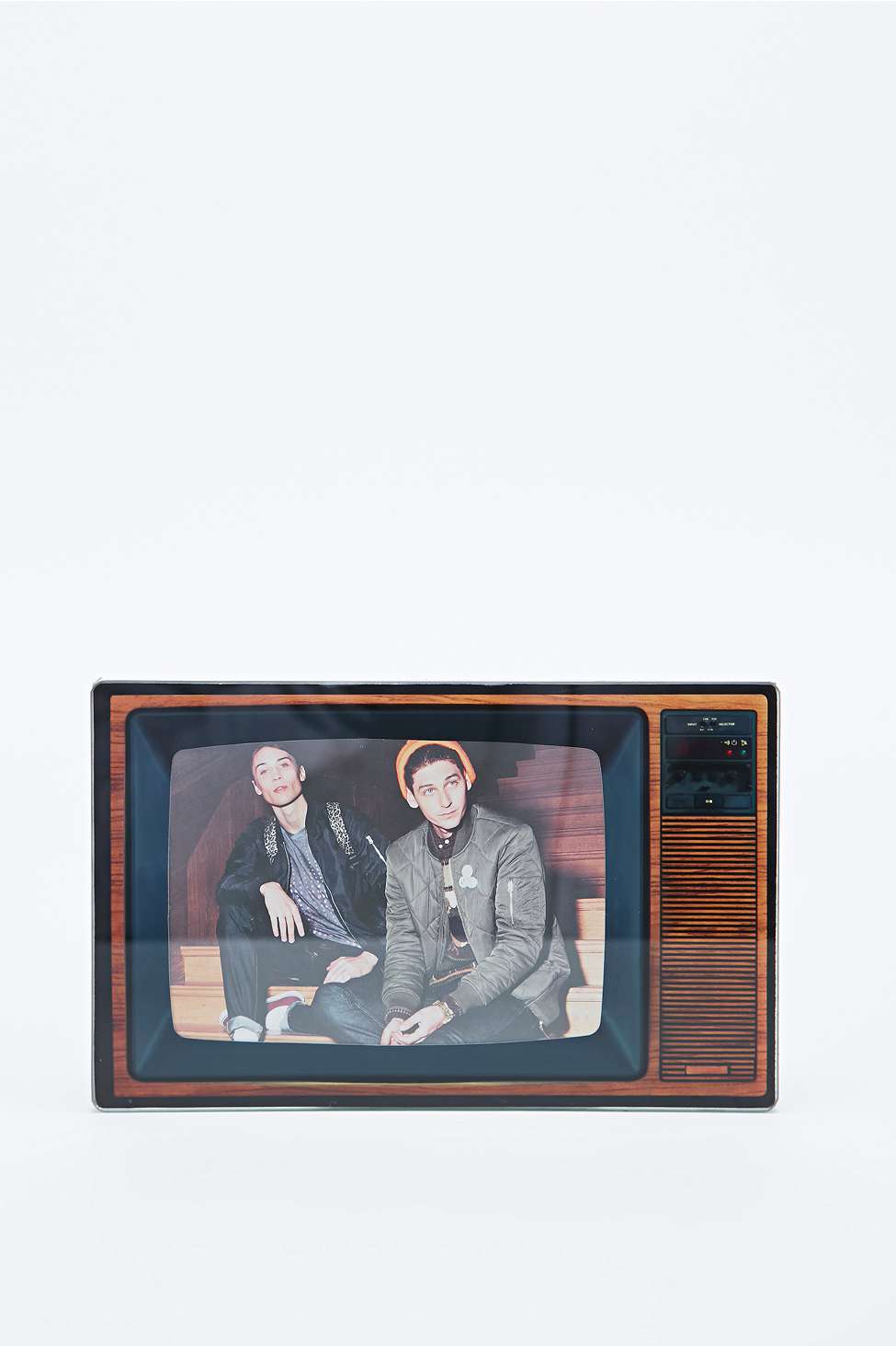
To begin with, I have googled backing paper frames. Not a lot of images came up in the search, so I decided I would look at online stores and the photoframes that they offer. I firstly started by looking on Urban Outfitters. I think the image and the frame below really compliment each other, as the colours and image style really match with the tv style, however it could've worked even better if the image was in black and white and was quite grainy.
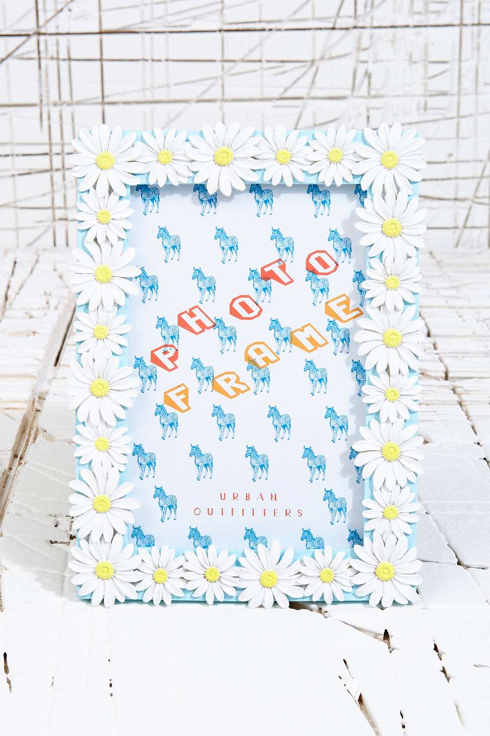
Personally, I don't think the backing image in the frame below works too well as the image and the frame don't relate too well, as the image is illustrations of horses and the frame is created out of a daisy change pattern. I think the image would've worked a lot better if it was in black and white and the type was in colour, as I think there is a little too much going on and it's quite harsh to look at.
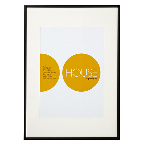
I then decided that I would look online at photoframes from Marks and Spencers, however the photoframes on there didn't have any images in them. Personally, I think these actually look a lot better displayed like this, as they are simple and you seem to get a better look at the frame, as the eye isn't distracted by the image. I then decided I would look at John Lewis. I think this design is really great as it's incredibly simplistic and modern. I think the typography used really works as well, as the 'O' matches the circle theme.
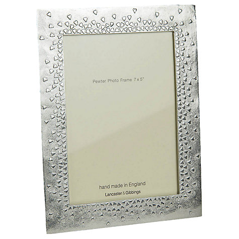
I think this design is a little too simplistic and I don't personally enjoy the colour scheme used, however it does fit with the frame, as it doesn't distract from the design of the frame.
I will create a new post on the weekend once I have gone to the shop to look at some designs in store, as I don't think I can get the true effect of the image online.
No comments:
Post a Comment