Font: A font is a collection of letters, numbers, punctuation and symbols used to set text. Font refers to the physical embodiment (whether its a metal set or computer file), whilst typeface refers to the actual design. Put simply, a font is what you use, a typeface is what you see.

I have made a little info graphic of the basics of cap height, x-height and baselines. I find this a lot easier to understand visually as it's a lot clearer to picture where each letter fits in within the lines.

I have highlighted the difference between a sans serif font and a serif font above. Serif fonts have an extra stroke found at the end of the main strokes of some letterforms. For example, a sans serif font is the font Futura, and a serif font is the font Baskerville.
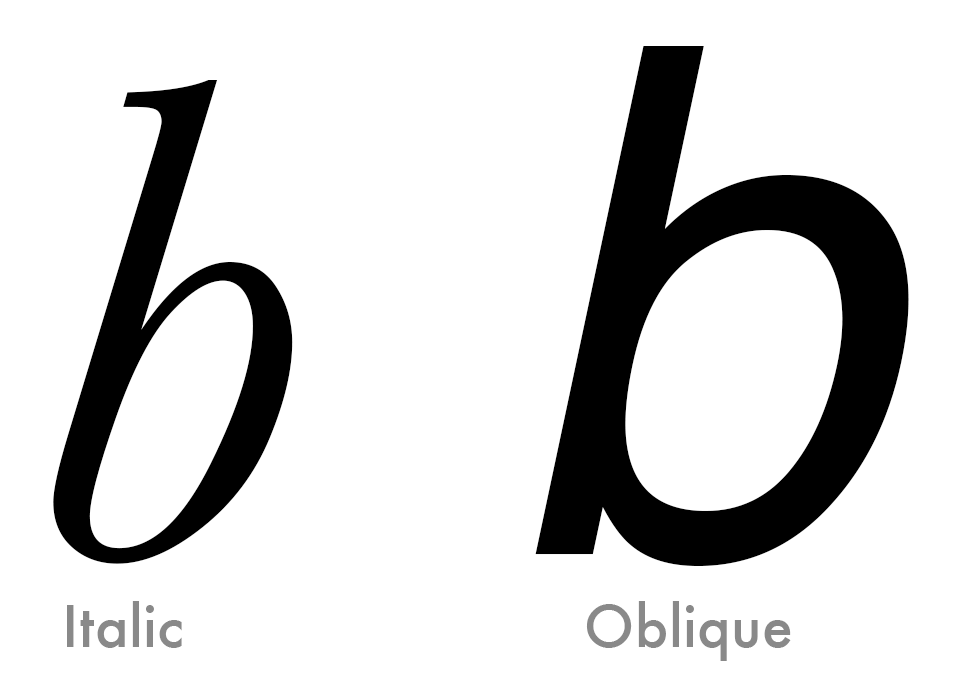
An italic type is a type that takes its basic shape from a form of handwriting, and it is usually narrower than the original type. They are commonly used for emphasis and are generally used in serif fonts. An oblique type is the original type that is pushed over slightly to create an italic style, and then edited slightly, such as they are often narrower than the original.

A Diacritic is a mark added to a letterform. In the Latin alphabet, their function is to change the sound value to the letter they are added to. In other alphabetical systems such as Arabic, they may indicate sounds which are not conveyed by the basic alphabet.

A superscript is a letter, figure or symbol that is placed or printed above the normal line of type. This is generally used when writing time and dates, e.g, the 8th - the TH would be a superscript.

A subscript is a letter, symbol or figure that is placed or printed below the normal line of type. This is used a lot in the Periodic Table, to show elements and compounds.

Kerning refers to the process of adding or subtracting the volume of space between specific letters or characters. Below is an example of a word that has a big kerning.

A counter is the enclosed circular or curved negative space of some letters, such as 'O' and 'S'. An eye is similar, although the eye refers specifically to the enclosed space in the lowercase 'e'. A loop/lobe is the enclosed negative space in a double-storey 'g'.

A bowl is the curved part of the character that encloses the circular or curved parts (counters) of some letters, for example 'd', 'b', 'd' and 'B'

A tail is the descending, ofen decorative stroke on the letter 'Q' or the decending, often curved diagonal stroke on the 'K' or 'R'
No comments:
Post a Comment